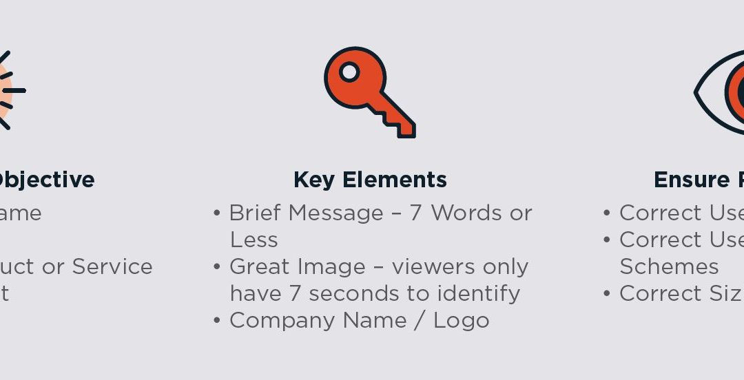
While billboards in general are a un-avoidable type of advertising, there are many tips and tricks to ensure that your message is seen by as many people as possible! The average person only views a billboard for 7 seconds, therefore you have to make sure that your creative can efficiently get your message across. Below are a few do’s and don’ts to keep in mind when designing creative for your boards.
Do’s:
- Utilize bold and clear fonts
- Keep your message brief – aim for 7 words or less
- Use high contrasting color combinations
- Make sure your company logo or name is present
Don’ts:
- Use thin or script fonts
- Use colors that don’t contrast from each other
- Have a lot of text
Need creative for a billboard but don’t have an in-house graphic designer? Not a problem! Our team of graphic designers can design creative that helps you achieve your goal and draw attention!
